
📅 Originally Published: · Last Updated:
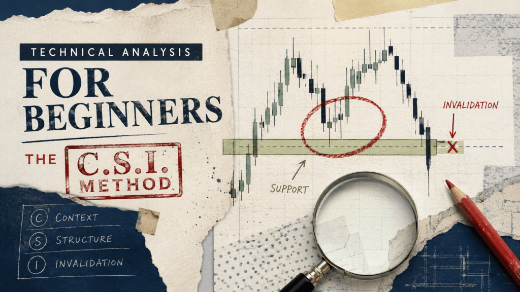
Answer first: A stock chart records what price and volume did. It does not reveal what price must do next. This guide rebuilds technical analysis for beginners around the C.S.I. method: check the Context, mark the Structure, and define the Invalidation before treating any pattern as useful. Use the checklist before acting on a chart pattern, especially when the shape looks persuasive but the failure condition is unclear. C.S.I. is a chart-reading process, not a proven trading system or a promise of profit.
What Can a Stock Chart Actually Tell You?
A chart can show the path of traded prices, the range inside each period, and the amount of activity recorded as volume. It can help you see whether price has been rising, falling, or moving sideways. It can also show where price previously stalled, accelerated, or reversed. Traders may interpret those reactions as changes in buying or selling pressure, but the chart does not identify who traded or why.
A chart cannot tell you that a company is worth a specific amount, that a support zone will hold, or that a candle pattern will repeat. Andrew Lo, Harry Mamaysky, and Jiang Wang formalized chart-pattern recognition in a Journal of Finance study. Their paper also identifies the subjectivity of visual chart interpretation as a central obstacle. A pattern may contain information without becoming a dependable standalone trading edge.
The broader evidence is mixed and sensitive to testing method, market, period, data-snooping controls, and trading costs. Park and Irwin’s review of the empirical literature found materially different results across markets and between early and modern studies. This article therefore does not claim that C.S.I. beats buy-and-hold. For a focused audit of testing risk, read Technical Analysis Works Only Under Three Conditions. This page has a narrower job: teach a disciplined way to describe a chart before money enters the picture.
| Question | A chart may help with | A chart cannot guarantee |
|---|---|---|
| Direction | Whether recent prices have trended up, down, or sideways | The direction of the next candle |
| Location | Where prior reactions occurred | That the same price will hold again |
| Participation | Whether trading volume expanded or contracted | Who bought, who sold, or why they traded |
| Risk planning | Where your chart idea stops making sense | The price at which an order will execute |
How Do Candlesticks Compress Price Information?
For beginners, candlesticks are useful because one candle displays four prices for a selected period: open, high, low, and close. A daily candle summarizes one trading day. A weekly candle summarizes one week. The same shape can mean something different when the timeframe changes.
The body runs between the open and close. The wicks extend to the period’s high and low. A long lower wick shows that price traded below the candle body and finished above the period low. Traders may describe that shape as rejection, but the candle alone does not establish a durable floor or predict the next candle.
Plain English
A candle tells you where price traveled and where it finished. It does not tell you why the move happened or whether the reaction will continue.
That is also why a line chart is not useless. A line chart strips away intraperiod detail and makes closing-price trends easier to scan. Candles provide more information; line charts provide less noise. Pick the format that answers the question you are asking.
Do not promote one candle into a trading rule. TheFinSense’s separate review of candlestick pattern win rates explains why pattern definitions, context, and testing choices matter more than an attractive example on a chart.
What Is the C.S.I. Method?
The C.S.I. method is a three-pass checklist for reading a stock chart. It moves from broad information to a specific failure condition instead of jumping from one colorful candle to a buy button.
| Pass | Question | What you record | Stop condition |
|---|---|---|---|
| C: Context | What timeframe and trend am I viewing? | Timeframe, benchmark, trend state, major event risk | The chart is too short, illiquid, or event-distorted |
| S: Structure | Where has price reacted more than once? | Zones, not single-pixel lines | The level exists only because you forced it onto the chart |
| I: Invalidation | What would make my interpretation wrong? | A price or closing condition that breaks the idea | You cannot define the risk before entering |
The third step is Invalidation because a green hammer is not an engine switch. The useful question is whether you know what evidence would make your reading wrong. That makes the process less exciting, but more explicit about uncertainty and failure conditions.
C: Is the Context Clear Enough to Read?
Start by fixing the timeframe. A daily chart may show an orderly uptrend while a five-minute chart shows a sharp decline. Neither chart is lying. They are answering different questions. Match the timeframe to the decision horizon before drawing conclusions.
Next, zoom out. A six-month window can hide a multi-year decline. A five-year window can compress a recent breakdown until it looks harmless. A practical beginner routine is to review the weekly chart first, then the daily chart. The weekly view supplies context; the daily view supplies detail.
How should you use a moving average?
A moving average is a smoothed average of past prices. It is a lagging reference, not a health diagnosis. A 50-day simple moving average can help describe medium-term direction, but price crossing that line does not automatically make a stock safe, cheap, expensive, bullish, or bearish.
Use the line as one context clue. Ask whether it is rising or falling, whether price repeatedly crosses it, and whether the asset is in a clean trend or a sideways range. The difference between SMA and EMA is covered in SMA vs. EMA crossover analysis.
Context failure: If your conclusion changes completely every time you zoom in or out, you do not have a stable chart thesis yet.
S: Is There Real Structure or Just a Line You Drew?
Support and resistance mark areas where price previously stalled or reversed. Technical analysts often interpret those reactions as shifts in supply and demand, but the chart alone does not identify who traded or why. Fidelity’s support and resistance guide describes levels where buying or selling pressure may become strong enough to slow a move. In practice, treat them as zones because trades do not cluster at one perfect decimal.
Three checks for a defensible zone
- Repeated reaction: Price responded in the area more than once, preferably on separated dates.
- Visible without precision games: The zone still looks relevant when you change chart size slightly.
- Enough liquidity: A single thin trade or overnight gap did not create the entire level.
A standard volume bar shows trading activity, not participant identity or motive. Higher volume may strengthen the significance of a price move, but it does not prove that institutions were accumulating or distributing shares. Schwab’s volume guide similarly treats volume as confirmation that may strengthen or weaken a price interpretation, not as a standalone verdict.
For a deeper audit of how lines become persuasive after the fact, see trendline survivorship bias and the focused guide to support and resistance.
I: Where Is the Chart Idea Invalidated?
Invalidation is the price behavior that makes your chart interpretation no longer reasonable. It is not the amount of money you feel comfortable losing, and it is not a guarantee that an order will fill at that price.
Suppose a stock is in a medium-term uptrend and repeatedly reacts between $94 and $96. Your hypothesis might be: “This zone remains relevant while daily closes stay above $93.” A close below $93 would invalidate that specific reading. It would not prove the company is bad or that price must continue lower.
The risk boundary must exist before entry. If the distance between entry and invalidation is too large for your account, reduce position size or skip the trade. Do not move the boundary simply because price is approaching it.
Risk check: Chart invalidation answers “When is my idea wrong?” Position sizing answers “How much can that mistake cost?” You need both.
A stop order adds execution risk. Investor.gov explains that a stop price is only a trigger. Once triggered, a stop order becomes a market order, and the actual fill can differ significantly in a fast market. Read the SEC investor bulletin on stop orders before treating a stop level as a guaranteed exit.
How Does the C.S.I. Method Work in a Hypothetical Example?
Consider a hypothetical stock trading near $96. Both possible outcomes matter: one supports the interpretation, and the other breaks it.
| C.S.I. step | Observation | What it means |
|---|---|---|
| Context | Weekly trend is rising; daily price is pulling back | The pullback is occurring inside a broader uptrend, but the trend can still fail |
| Structure | Price reacted between $94 and $96 on two prior occasions | The zone is worth monitoring, not assuming |
| Invalidation | Daily close below $93 | The support-zone interpretation is no longer valid under the chosen rule |
Outcome A: the zone holds
Price trades down to $94.50, closes back at $96, and remains above the zone over the next sessions. The chart interpretation survives. That does not mean a rally to $110 is owed. The only conclusion is that the chosen invalidation condition has not occurred.
Outcome B: the zone fails
Price gaps down and closes at $91. The chart interpretation failed, and a stop order could fill below its trigger. Support did not promise a bounce. It was a hypothesis, and the market produced contrary evidence.
A beginner needs to see both outcomes. A successful bounce alone teaches hindsight; a useful framework also shows exactly how the idea can fail. That is why the failure case belongs in the lesson.
Frequently Asked Questions About Technical Analysis for Beginners
Does technical analysis predict stock prices?
No chart method can guarantee a future price. Technical analysis describes historical price and volume behavior and may help define hypotheses, timing rules, or risk boundaries. Research results vary by market, period, rule definition, data-snooping controls, and transaction costs. Treat any pattern as a testable claim rather than proof.
Is a hammer candle a buy signal?
Not by itself. A hammer-shaped candle shows that price traded lower and recovered during the selected period. Its relevance depends on the preceding trend, nearby structure, liquidity, timeframe, and confirmation rule. A visually convincing hammer can still fail immediately.
Is the 50-day moving average the best trend filter?
There is no universally best period. The 50-day average is popular and easy to read, but it lags price and can create repeated false turns in sideways markets. The appropriate period depends on the asset, timeframe, and rule being tested.
Does high volume mean institutions are buying?
No. A standard volume bar shows trading activity, not the identity or motive of each participant. High volume can accompany accumulation, distribution, news reactions, index rebalancing, hedging, or forced liquidation. Use it as context, not proof of institutional direction.
Should beginners trade with real money after learning C.S.I.?
Learning the checklist does not establish an edge. Practice describing charts and recording invalidation rules first. Any real-money decision still requires position sizing, order-type knowledge, taxes, costs, and a written investment or trading plan. An investment policy statement is a better starting point for long-term investors.
Bottom Line: Technical Analysis for Beginners Needs a Failure Rule
The most important chart skill is not naming a hammer, spotting a moving average, or drawing a clean support box. It is separating observation from prediction.
Use C.S.I. in order. Confirm the timeframe and trend under Context. Mark repeated reaction zones under Structure. Define the evidence that would make the idea wrong under Invalidation. When any step is unclear, stop interpreting and keep observing.
That is the honest role of chart analysis for beginners: organize what the chart shows, expose what it does not show, and define risk before confidence takes over.
Keep reading: Test the claims behind this framework in Technical Analysis Works Only Under Three Conditions, then compare pattern evidence in Candlestick Pattern Win Rates and Support and Resistance.
YOUR TURN
Which part of your last chart idea was weakest: context, structure, or a clearly defined invalidation rule?
- Lo, Mamaysky & Wang (2000): used to frame chart patterns as testable statistical objects while acknowledging the subjectivity of visual interpretation.
- Park & Irwin (2007): used to characterize the empirical record as method- and market-sensitive rather than universally positive or negative.
- Fidelity support and resistance guidance: used for the standard technical interpretation of prior reaction areas, with the article separately limiting what a chart can directly establish.
- Charles Schwab volume guidance: used to limit volume claims to confirmation context rather than participant identification.
- SEC investor bulletin on stop orders: used to verify that a stop price is a trigger, not a guaranteed execution price.
- Method: no C.S.I. win rate, forecast probability, or expected return is claimed. Hypothetical prices illustrate decision logic only. The article distinguishes observed chart data, interpretation, and risk-management choices.
- Evidence ceiling: these sources support definitions and risk limits. They do not validate C.S.I. as a profitable strategy.
- Failure modes: chart interpretation remains sensitive to timeframe, adjusted price data, liquidity, gaps, event risk, transaction costs, taxes, and subjective zone placement.
Source mix: 2 peer-reviewed studies, 1 SEC investor bulletin, 2 broker education pages, and TheFinSense framework design. No vendor win-rate claim was used.
Update history
- v2.1 2026-07-31 MINOR REVISION
Separated observed price behavior from supply-and-demand interpretation, narrowed candlestick and volume claims, removed unverified safety language, converted internal links to canonical URLs, and refreshed source and disclosure markup.
- v2.0 2026-07-12 MAJOR REVISION
Reframed C.S.I. around context, structure, and invalidation; removed unsupported performance claims; added failure cases; and refreshed the supporting sources.
- v1.0 2026-02-22 PUBLISH
Original publication.