
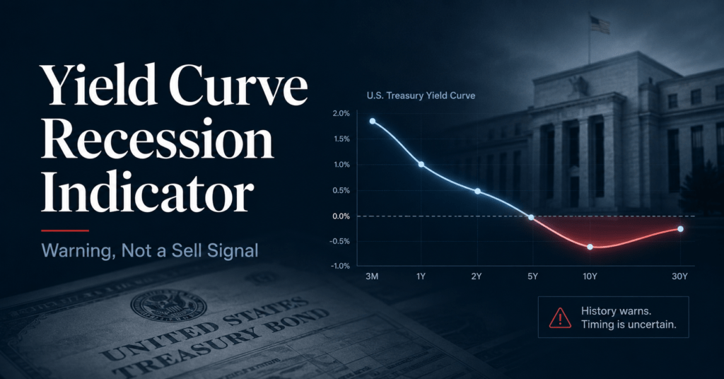
The yield curve recession indicator is useful for estimating economic risk, but it does not tell investors when to sell stocks. The 10-year minus 3-month Treasury spread has a strong historical forecasting record, yet Federal Reserve research places the typical lead time at about one to two years. Use an inversion to review liquidity, allocation, and recession exposure. Do not treat it as a same-day market exit order.
An inverted curve gets attention for a good reason. Short-term Treasury yields have moved above long-term yields before every one of the last eight US recessions tracked in the Cleveland Fed’s 10-year minus 3-month framework. The same source also records two notable false positives, so the signal is neither useless nor flawless.
The harder mistake happens after the headline. A recession forecast and a stock-market timing rule answer different questions. One estimates the chance of an economic contraction. The other requires an exit date, a re-entry date, a treatment of dividends and cash yield, and a plan for taxes and trading costs.
The analysis therefore uses Federal Reserve research for the forecasting record, dated Federal Reserve data for the current reading, and a bounded 2022 episode study for the market path. The episode shows the timing problem; it does not prove that holding stocks always wins.
What Does the Yield Curve Indicator Actually Tell You?
The yield curve recession indicator measures the gap between a longer Treasury yield and a shorter one. The most established recession model uses the 10-year yield minus the 3-month yield. A negative spread means the curve is inverted. Historically, that condition has signaled higher recession risk about a year or two ahead, but the relationship is predictive rather than a proven one-way cause.
A normal Treasury curve usually slopes upward because investors demand more yield for lending over longer periods. During an inversion, short rates sit above long rates. That can happen when current monetary policy is tight while bond investors expect weaker growth and lower policy rates later.
The maturity pair matters because there is no single curve. Financial news often quotes the 10-year minus 2-year spread. The New York Fed and a long academic tradition use the 10-year minus 3-month spread. Engstrom and Sharpe studied a near-term forward spread built from expected short rates over the next six quarters.
The mechanism also needs restraint. Bauer and Mertens found that yield-curve spreads forecast recessions well, but they explicitly warned that the statistical relationship does not establish cause and effect. Tight policy may slow the economy, investors may anticipate a downturn and buy long Treasuries, or both processes may operate together.
Primary source: Bauer and Mertens, Information in the Yield Curve about Future Recessions, Federal Reserve Bank of San Francisco, 2018. Read the paper.
Use this analysis if: you are a long-term investor deciding whether an inversion should change a diversified portfolio.
Use a different framework if: you need the money soon, trade tactically under a tested rule set, or hold concentrated credit-sensitive positions. In those cases, liquidity and position-specific risk can matter more than the broad curve.
How Reliable Is the Yield Curve Recession Indicator?
Federal Reserve research supports the yield curve as a strong recession indicator, especially the 10-year minus 3-month spread. In a 1972 to 2018 comparison, four common spreads produced area-under-the-curve scores of roughly 0.85 to 0.89, where 0.5 represents no predictive power and 1.0 represents perfect classification. The differences among the leading measures were small, and none supplied a precise stock-market exit date.
Three findings matter more than the slogan that the curve “never misses.”
| Finding | Supported interpretation | Limit |
|---|---|---|
| 10-year minus 3-month | Slightly strongest of the compared spreads in Bauer and Mertens | Forecast accuracy differences were small |
| Near-term forward spread | Statistically dominated the familiar 10-year minus 2-year spread in Engstrom and Sharpe | It is a model input, not a direct trading rule |
| Lead time | Inversions typically appeared about one to two years before recessions | The lag is too wide for a same-day sell decision |
| Historical record | The Cleveland Fed says 10-year minus 3-month inversions preceded the last eight recessions | It also identifies two notable false positives |
Sources: Federal Reserve Bank of San Francisco, Federal Reserve Board, and Federal Reserve Bank of Cleveland. Different studies use different samples, spread definitions, and model designs.
Engstrom and Sharpe help explain why the near-term spread can work. Their measure reflects how markets expect conventional policy rates to move over the next 12 to 18 months. A negative reading means investors expect policy easing, often because they see a meaningful slowdown ahead. Their paper found that yields beyond 18 months added no forecasting value once the near-term signal was included.
That result does not make the popular 10-year minus 2-year spread worthless. Bauer and Mertens later compared several spreads and found similar overall accuracy. Their 10-year minus 3-month measure performed slightly better in that sample. The evidence supports a narrower conclusion: the 2-year spread is not the only useful curve, and the 3-month or near-term-forward versions often fit recession forecasting better.
Primary source: Engstrom and Sharpe, The Near-Term Forward Yield Spread as a Leading Indicator: A Less Distorted Mirror, Federal Reserve Board, 2018. Read the full paper.
For portfolio decisions, the lead-time problem remains. A signal can be useful to an economist and still be weak as an execution trigger. Stocks can rise, fall, and recover while the economy is moving from late expansion toward recession. The curve does not identify which of those market paths will occur first.
What Does the Current 2026 Reading Say?
The current yield curve recession indicator is no longer inverted on the main 10-year minus 3-month measure. FRED reported a positive 0.73 percentage-point spread on July 24, 2026. Using the June monthly average, the New York Fed model estimated a 16.0619% probability that the economy would be in recession twelve months later. The NBER-based FRED indicator still classified June 2026 as an expansion.
| Measure | Reading | As-of date |
|---|---|---|
| 10-year minus 3-month spread | +0.73 percentage points | July 24, 2026 |
| New York Fed 12-month recession probability | 16.0619% | June 2026 data, forecast for June 2027 |
| NBER-based recession indicator | 0, expansion | June 2026 |
These are dated readings, not permanent values. The spread updates on business days; the probability model updates monthly; NBER recession dates can be assigned retrospectively.
A positive curve does not guarantee that recession risk has disappeared. Normalization often happens because short rates fall, long rates rise, or both. The reason for the move and the surrounding credit, labor, and spending data still matter. Our business-cycle investing guide shows why no single indicator should carry the entire decision.
The two probability models also illustrate model risk. The Cleveland Fed’s June 2026 page showed a 13.6% one-year recession probability, while the New York Fed’s June estimate was about 16.1%. Both were in the mid-teens, but the exact output differed because the models are not identical.
Current sources: FRED 10-year minus 3-month spread · New York Fed probability model · NBER-based recession indicator · Cleveland Fed probability model.
What Happened After the 2022 Inversion?
On the 10-year minus 3-month measure, the yield curve recession indicator first moved below zero on October 18, 2022. From the October 2022 monthly average through June 2026, the S&P 500 price index rose from about 3,726 to 7,450, a 99.94% increase. This single episode shows that an inversion did not provide a timely stock exit in 2022. It does not prove that stocks always rise after inversions.
For the 2022 episode, the actual dated path is more informative than a cross-cycle average. It keeps the period, market path, and conclusion aligned.
Yield Curve Recession Indicator: S&P 500 Price Return After October 2022
Monthly-average price-index change from the first 10-year minus 3-month inversion month.
| Month | Monthly-average index | Cumulative price return |
|---|---|---|
| October 2022 | 3,726.05 | 0.00% |
| June 2023 | 4,345.37 | 16.62% |
| June 2024 | 5,415.14 | 45.33% |
| June 2025 | 6,029.95 | 61.83% |
| June 2026 | 7,450.03 | 99.94% |
It cannot support a blanket “never sell” rule. The chart is price return only. A complete sell-versus-hold comparison would need a specified cash vehicle and its changing yield, dividend reinvestment, tax treatment, execution dates, and a re-entry rule. Changing any of those assumptions changes the result.
Formula: (ending index / starting index) - 1
Start: October 2022 monthly-average S&P 500 price index, 3,726.050952.
End: June 2026 monthly-average S&P 500 price index, 7,450.03.
Result: 99.944394%, displayed as 99.94%.
Evidence ceiling: a dated single-episode comparison. It is not a causal test, a universal trading rule, or a total-return backtest.
The episode exposes the second timing problem. An investor who sold needed a rule for getting back in, and the curve never supplied one. Waiting for an official recession date would not solve the problem because the NBER dates cycles retrospectively.
Should You Sell When the Curve Inverts?
Most long-horizon investors should not sell solely because the yield curve inverts. The better response depends on why the money is invested, when it will be needed, and whether the portfolio has drifted away from its target. The yield curve recession indicator can justify a plan review. A sale needs a separate portfolio reason.
| Your situation | Useful response | Why |
|---|---|---|
| You need the money within 12 to 24 months | Build the required cash or short-duration reserve | Liquidity risk exists regardless of the curve |
| Your stock allocation is above target | Rebalance to the written target | The action follows portfolio drift, not a forecast |
| Your horizon is long and the plan is intact | Keep contributing and review risk capacity | The curve does not identify an exit or re-entry date |
| You run a tactical strategy | Use the spread only inside a pretested, cost-aware rule | A macro input alone is not an executable strategy |
| You hold concentrated cyclical or credit exposure | Stress-test the position and funding needs | Security-specific downside may exceed broad-index risk |
Start with the spending horizon. Money needed soon should not depend on a favorable stock return over the next year. Moving that amount to an appropriate reserve can be sensible even when the curve is steep. That decision rests on a known liability rather than a macro forecast.
Next, compare the portfolio with its target. An inversion may prompt the review, but any trade should follow the allocation rule. Our portfolio rebalancing framework explains how to separate drift control from market prediction.
Then check operational details before trading. Tax lots, automatic dividend reinvestment, cash sweep settings, and order type can change the result of an otherwise reasonable decision. Review those items in the brokerage account settings guide.
How much money must leave the portfolio, and when?
Compare current weights with the written target.
Let the curve inform stress tests, not dictate a trade.
A tactical exit still needs a re-entry rule. Selling on an inversion requires two timing decisions: when to exit and when to return. A backtest that assumes perfect re-entry near a low has hindsight built into it. A usable rule must specify the signal, execution lag, transaction costs, cash return, rebalance frequency, and out-of-sample test before it can guide money.
Yield Curve Recession Indicator FAQ
What is the yield curve recession indicator?
It is a term spread, usually a long Treasury yield minus a short Treasury yield. The New York Fed’s recession-probability model uses the 10-year yield minus the 3-month yield. A negative value is an inversion and has historically been associated with higher recession risk over the following year or two.
Which yield curve spread should investors watch?
For recession forecasting, the 10-year minus 3-month spread has the strongest long academic tradition and performed slightly best in Bauer and Mertens’ comparison. The near-term forward spread also has strong support and outperformed the familiar 10-year minus 2-year spread in Engstrom and Sharpe’s model. Watching one definition consistently is more useful than switching measures to fit a preferred conclusion.
How long after an inversion does a recession begin?
Federal Reserve research says the main spreads have typically inverted about one to two years before recession onset. That is a rough historical pattern, not a countdown clock. False positives occur, recession dates are assigned retrospectively, and the stock market can follow a different timetable from the economy.
Is the yield curve inverted now?
No on the 10-year minus 3-month measure as of July 24, 2026. FRED reported a positive spread of 0.73 percentage points. Because the value changes daily, check the dated FRED series rather than relying on an undated article or screenshot.
Does an inversion mean I should move my 401(k) to cash?
Not by itself. A 401(k) change should follow your time horizon, risk capacity, written allocation, and need for near-term withdrawals. An inversion can be a reason to review those inputs. It does not provide a reliable exit date or a re-entry date.
The Bottom Line on the Yield Curve Recession Indicator
The yield curve deserves respect as an economic warning. The 10-year minus 3-month spread has a strong historical forecasting record, and the near-term forward spread adds a useful view of expected policy easing. Both are better suited to recession-risk analysis than to day-level market timing.
For most investors, the order starts with known spending needs, then portfolio drift and concentrated risks. The curve belongs after those checks as macro context. The 2022 episode shows how long the gap between warning and tradable outcome can become. It does not promise the same path next time.
Your turn
Before the next inversion headline, write down the portfolio fact that would actually justify a trade: a spending date, an allocation band, or a position limit.
- FOUNDATIONAL Bauer and Mertens (2018), Federal Reserve Bank of San Francisco. Compared common term spreads using monthly data from 1972 to 2018; identified the 10-year minus 3-month spread as slightly strongest and warned against causal overinterpretation.
- FOUNDATIONAL Engstrom and Sharpe (2018), Federal Reserve Board. Tested the near-term forward spread and showed that it subsumed the recession-forecasting information in the 10-year minus 2-year spread in their model.
- SUPPORTING New York Fed, FRED, and Cleveland Fed. Supplied the dated 2026 spread, recession-probability, recession-status, and historical-record checks.
- CONFIRMATORY 2022 episode study. Recomputed every displayed S&P 500 row in Python from the cited monthly data package. The evidence ceiling is descriptive and episode-specific.
Editorial transparency: This article was revised with AI assistance. Load-bearing claims were checked against primary Federal Reserve sources, and displayed calculations were independently reproduced in Python. Final publication remains subject to Danny Hwang’s editorial approval.
Editorial review process for this article
1. Existing-article audit. The original claim structure, numbers, sources, internal links, classes, and WordPress compatibility were reviewed on July 26, 2026.
2. Data and reasoning validation. The historical-average portfolio example was removed after a subject-match and provenance failure. Current readings were rechecked, and the 2022 episode was independently recomputed.
3. Reader pass. The revised article was read end-to-end for reader usefulness, factual scope, and naturalness on July 26, 2026.
This article is for educational purposes only and is not investment, tax, or financial advice. Markets carry risk, historical relationships can change, and a macro signal may not fit your horizon, liabilities, or portfolio.
Financial disclosure: TheFinSense receives no compensation from any broker, platform, issuer, or research institution cited in this article.
Update history
- v2.0 2026-07-26 MAJOR REVISION
Removed a mixed-period historical-average example and its derived rule; added dated 2026 readings, an actual 2022 episode study, a decision router, corrected source hierarchy, and refreshed trust disclosures.
- v1.0 2026-06-27 PUBLISH
Original publication.